

In This Lesson You Will Learn What Is A Strategic Data Plan Dashboard
The purpose of a Strategic Data Plan Dashboard is to translate business objectives into trackable KPIs and metrics so you can evaluate the performance of your website and digital campaigns.
It provides a framework with visual dashboards to help business owners and marketers make informed decisions to achieve the website goals and business objectives.
Strategic Data Plan Dashboard View
About The Strategic Data Plan Dashboard
A simple and easy-to-use dashboard, created by Web Wonks as part of the Data Health Kit job.
The dashboard acts as a reporting tool, providing a framework to help you make informed decisions for achieving the website goals and business objectives.
The dashboard is designed using 6 different pages, each providing different types of data metrics e.g. sessions, users, avg. session duration, goal completions, goal conversion rate etc.
Data from 3 sources is used i.e. Google Analytics, Google Search Console and Google Ads.
The dashboard allows you to filter the data by date in case you’re wanting to review data for a specific timeframe. In order to make data more understandable, red and green indicators have been used - red indicates poor performance and green indicates good performance of a specific data metric.
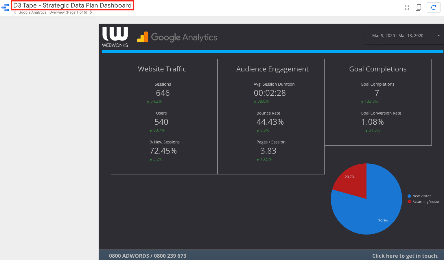
Google Analytics Overview
This page of the dashboard contains traffic, audience engagement and conversion data metrics.
The traffic section contains summarized information regarding the number of users and sessions on your website for the selected timeframe. Engagement section contains avg session duration i.e. the average length of a Session, bounce rate i.e. the percentage of single-page sessions in which there was no interaction with the page and pages/session i.e. the average number of pages viewed during a session.
The conversions section contains the number of conversions (goals) your website has received and the rate of conversion (conversion metrics will be discussed in detail later on).
At the bottom right corner of the page is a pie chart demonstrating the percentage of male and female users that through to your website.
This page gives you an overall view of the online data for your website.
Google Analytics Devices & Demographics
This page of the dashboard is specifically focused on providing the data metrics based on the device variables e.g. desktop, mobile and tablet.
The first row consists of 3 pie charts i.e. total sessions, bounce rate and goal completions (conversions). Each pie chart displays information for a particular metric using the device variables e.g. percentage of total sessions from mobile, desktop and tablet on your website. Different colours are used to differentiate between the device categories.
The table in the lower left corner gives basic data for various age cohorts that have come through to your website. The bi colour pie chart at the bottom gives out the percentage of male and female users coming to your site.
The good thing is that you can filter all the data metrics for this page by gender, age or device category. This information is really useful in understanding your online audience + channel through which you want to reach them i.e. mobile, desktop etc.
Google Analytics Insights
This page of the dashboard allows you to observe data for various traffic channels through which users are coming to your website e.g. Organic, Direct etc.
It also provides data for different landing pages of your website e.g. how many sessions took place, what was the conversion rate and what is the exit percentage of users for a specific landing page.
The data on this page will enable you to identify which traffic channel needs your attention in terms of improvement or which channels are your star performers as compared to the others + which landing pages need to be improved or reviewed for performance optimization.
Google Analytics Conversions
This page of the dashboard provides integral information about the leads coming through your website.
Leads from your website can come in numerous ways e.g. phone link clicks, email link clicks etc. In order to define the leads in an orderly manner and for improved tracking purpose, each lead type is defined as a single goal e.g. contact form submission, phone link click etc.
This way, the data can be tracked in a refined way for each of the conversion triggers on your website. We can also see the data for engagement events on this page i.e. if the users engaged with a particular button to download a PDF file, clicked on a facebook link etc.
The goal completion data for the top 10 cities is displayed on the bottom right hand corner i.e. which city had the most online leads for you.
The information on this page enables you with better location targeting for your online advertisement campaigns + helps you to understand which kind of leads are coming through in majority.
Google Search Console Overview
This page of the dashboard pulls through the data from your Google Search Console.
The data metrics provide information for various search queries which are being used by the users to reach your website.
This data plays a pivotal role in selecting relevant keywords for your online advertisement campaigns + gives a picture of your organic ranking for various search terms, which then gives you the opportunity to focus on the search terms which matter the most to your business. It also enables you to understand the bigger picture of the industry you’re working in.
Google AdWords Overview
This page of the dashboard pulls through the data from your Google Ads account.
It provides us with brief, yet important data metrics for all of the ad campaigns in your Google Ads account. Metrics like clicks, impressions (views), conversions, cost etc. can help you analyse the performance of your ad campaigns for a specific timeframe.
The page also demonstrates data for the cost per lead for your ads i.e. the dollar amount you are paying to acquire each lead.
The table on the bottom right corner shows data for placement domain i.e. where are your ads being placed, what websites, what applications etc. The page gives you an overall picture of your online ads with Google.
If you are having an issue, we can help. Please get in touch.
This is one of the Google Looker Studio dashboard products offered by Web Wonks, as part of the Data Health Kit job, and not available as an open source template. Want help with your online business activity? You can always get in touch with Web Wonks and we can help you.